
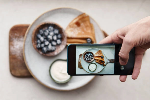
Food photography is more than just capturing a delicious dish; it’s an art form that can evoke emotions, highlight textures, and invite the viewer to experience the food through visual storytelling. One of the most powerful tools a food photographer can use is color theory. When colors are used thoughtfully, they can guide the viewer’s eye, enhance the food’s natural beauty, and even evoke memories or feelings associated with certain dishes.
Whether you’re shooting for a blog, social media, or a food magazine, mastering the basics of color theory will help you create vibrant and mouth-watering images that pop. In this article, we’ll explore ten essential color theory tips that can make your food photography truly stand out, helping you craft images that not only look great but also communicate the essence of the food
1. Use Complementary Colors to Create Contrast
Complementary colors are a powerful way to add contrast and visual interest to your food photography. These colors are opposite each other on the color wheel—think of red and green, blue and orange, or yellow and purple. When paired together, complementary colors create vibrant, eye-catching contrasts that make each element in the image stand out. For example, imagine a rich red tomato soup garnished with bright green basil leaves.
The green pops against the red, making the dish appear fresher and more appetizing. Similarly, a blue dish could enhance the orange tones of a sweet potato dish, drawing attention to the vibrant, earthy hue of the food. The key to using complementary colors effectively is moderation. Too much contrast can overwhelm the viewer, so balancing these bold colors with neutral tones or more subdued shades can help keep the image harmonious while still making it visually dynamic.
2. Play with Analogous Colors for Harmony
Analogous colors, which sit next to each other on the color wheel, offer a softer and more harmonious approach to color. These shades create a sense of unity and cohesiveness in your food photography, making the dish feel like a natural, inviting part of the scene. For instance, pairing shades of orange, yellow, and red can evoke warmth and comfort—perfect for cozy, autumnal dishes like roasted vegetables or a hearty soup.
By using analogous colors, you can avoid harsh contrasts while still offering visual interest. This technique is especially effective for foods that naturally lend themselves to certain color families. When you want to evoke feelings of warmth, freshness, or balance, using analogous colors can help you craft an image that’s soothing yet engaging.
3. Emphasize Texture with Monochromatic Schemes
Monochromatic color schemes involve using different shades, tints, or tones of a single color to emphasize the texture and details of your dish. This technique draws attention away from bold color contrasts and focuses instead on the intricate textures that define the food.
In food photography, this can be especially useful for highlighting the tactile qualities of a dish—such as the flaky layers of a croissant, the smooth creaminess of a mousse, or the crispy skin of roast chicken. This subtle use of color lets the viewer focus on the food’s surface qualities, adding depth and dimension to your photography. Monochromatic schemes can create a minimalist, high-end aesthetic that appeals to viewers’ senses beyond just color.
4. Use Color Accents to Guide the Viewer’s Eye
Strategically using color accents is a simple yet effective way to guide the viewer’s eye to the most important elements in your food photography. Color accents can help direct attention toward the key focal points in your image, making the composition feel intentional and well-balanced.
Additionally, color accents can break up more neutral tones, preventing the image from feeling too monotonous. The key to mastering color accents is subtlety. A single bright color can be impactful when used sparingly, creating contrast and leading the viewer’s gaze naturally across the image. This technique ensures that the food remains the star of the photo while keeping the composition visually dynamic.
5. Contrast Warm and Cool Tones for Depth
Balancing warm and cool tones in your food photography can add depth and richness, creating a more dynamic and engaging image. Warm tones—such as reds, oranges, and yellows—tend to evoke feelings of comfort, energy, and warmth. Cool tones, like blues, greens, and purples, can create a sense of calm, freshness, and sophistication.
When used together, warm and cool tones can create a sense of depth, guiding the viewer’s eye through different layers of the image. Using warm and cool tones thoughtfully allows you to convey multiple sensations—richness, freshness, comfort—all within a single frame, resulting in a more dynamic and layered composition.
6. Be Mindful of Color Temperature
Color temperature in food photography refers to the warmth or coolness of the light in your image, which directly affects how your colors appear. Warmer light tends to make food look more inviting and appetizing, often enhancing the golden or red tones of the dish, making it feel cozy and rich. This is ideal for capturing baked goods, grilled meats, or hearty soups.
On the other hand, cooler light can work wonders for fresh, crisp dishes like salads, seafood, or beverages. It accentuates greens, blues, and whites, giving the image a clean and refreshing look. Understanding the relationship between color temperature and the food you’re photographing is essential for achieving the desired mood.
7. Use Natural Colors to Evoke Freshness
In food photography, colors that are associated with nature—like greens, browns, and soft yellows—can evoke a sense of freshness and health. These natural tones work particularly well for photographing fresh produce, salads, or farm-to-table dishes, emphasizing their organic origins. A salad featuring bright green lettuce, ripe red tomatoes, and earthy brown croutons feels fresh and vibrant, especially when these colors are allowed to shine naturally in the photograph.
Avoid over-saturating the image, as this can sometimes make the food look artificial. Instead, let the natural colors of the ingredients speak for themselves. You can also incorporate natural backgrounds, like wooden tables or stone surfaces, to complement these colors and enhance the organic feel. Using natural colors not only highlights the freshness of the food but also creates a sense of authenticity, making the viewer feel like they’re experiencing the dish in its purest, most wholesome form.
8. Create Mood with Muted Tones
Muted tones are excellent for creating a specific mood or atmosphere in your food photography, especially if you’re aiming for a rustic, homey, or nostalgic feel. Softer colors like beige, grey, brown, and pastel shades create a sense of warmth and comfort without being too overwhelming. These tones are ideal for capturing dishes that evoke memories of home-cooked meals or traditional, hearty fare.
By dialing down the saturation, you allow the texture and details of the food to take center stage, creating an inviting, cozy atmosphere. This approach is particularly effective for baked goods, slow-cooked dishes, and artisanal foods where the story behind the dish is just as important as its presentation.
9. Balance Bold and Neutral Tones
Balancing bold and neutral tones in your food photography is key to creating images that are both visually striking and harmonious. Bold tones—such as reds, oranges, or purples—add energy and excitement to your photos, instantly drawing the viewer’s eye. However, when overused, bold colors can overwhelm the composition and make the image feel chaotic. This is where neutral tones—like whites, beiges, and grays—come in.
Neutral colors provide a calming backdrop that allows the bold tones to stand out without competing for attention. Neutral tones can also act as a frame, focusing attention on the food while maintaining a clean and elegant look. By carefully balancing bold and neutral tones, you can ensure that your food remains the star of the photo while keeping the overall composition well-balanced and aesthetically pleasing.
10. Adjust Saturation for Impact
Saturation refers to the intensity of a color, and adjusting it can significantly impact the mood and appeal of your food photography. Highly saturated colors are bright, vivid, and attention-grabbing, making them perfect for dishes with bold flavors or vibrant ingredients like tropical fruit salads, spicy curries, or colorful cocktails. However, too much saturation can make the image appear unnatural or overly processed.
On the other hand, reducing saturation creates a more muted, subtle look that can be elegant and sophisticated, especially for more delicate dishes like pastries or fine dining plates. Adjusting saturation can also help you control the overall mood of your image. Finding the right level of saturation is key to ensuring that your colors enhance the food without overpowering it. Experimenting with different saturation levels allows you to find the perfect balance that complements your food’s natural beauty and the message you want to convey.
Mastering color theory in food photography is not just about making your images look vibrant but about telling a visual story that communicates the essence of the dish. Colors evoke emotions, guide the viewer’s eye, and enhance the textures and flavors captured in your photos. By applying these ten color theory tips, you can transform your food photography from simple snapshots to visually striking works of art that stand out from the crowd.
Whether you’re working with complementary color schemes to make elements pop, using analogous colors for harmony, or adjusting saturation to control mood, every decision you make with color has the power to elevate your photography. The next time you prepare to capture a dish, think about how color can enhance its appeal, tell its story, and make it memorable for your audience.
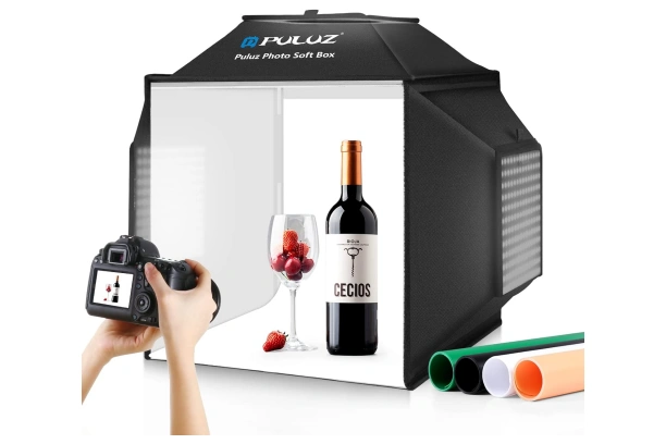
PULUZ Professional Shooting Tent
- What We Like
- Multi-angle Shooting
- 4 Color PVC Backdrops
- Quick Assembly
- Stepless Dimming
- What We Don’t Like
- Limited Size
- Background Color Limitations
- Durability Concerns
The photo light box is an excellent choice for both amateur and professional photographers, offering a blend of versatility and convenience. The box’s multi-angle shooting capabilities, with three openings and a specialized baffle for reflective items, ensure optimal lighting for various photography needs. With a rapid assembly time of just 10 seconds and a portable, durable design, this light box is compact yet functional, addressing common issues like shadows and reflective light effectively. Whether for beginners or seasoned pros, it provides a reliable solution for high-quality product photography.
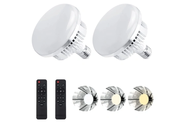
Skytex 2Pack 135W Photography Light Bulb
- What We Like
- Adjustable Color Temperature
- Long Service Life
- Wide Compatibility
- Convenient Remote Control
- What We Don’t Like
- Limited Remote Control Range
- Non-Replaceable Bulbs
- No Remote Control Batteries
This kit includes two LED lights and two remote controls, offering three adjustable light modes—white, warm, and cool—so you can tailor the lighting to fit any scenario. With color temperatures ranging from 2700K to 6400K, you have the flexibility to create the perfect ambiance for your shoots. The LED bulbs, housed in durable ABS material, boast an impressive lifespan of over 20,000 hours, ensuring long-term reliability. Compatible with any standard E27 socket, these lights are ideal for both amateur and professional photographers. Enjoy effortless control over your lighting setup and capture stunning, well-lit images every time.
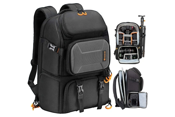
- What We Like
- Large Capacity
- Customizable Interior
- Shock-Proof Protection
- Ergonomic Design
- What We Don’t Like
- Limited Quick Access
- Laptop Compatibility
- Weight Distribution
The TARION PB Camera Backpack is designed for professional photographers seeking both capacity and protection for their gear. With space for one camera and up to five lenses, it offers adjustable padded dividers and compartments that can be reorganized to fit larger equipment like a handheld stabilizer. The quick side access allows photographers to retrieve gear without removing the bag, and it features a dedicated compartment for laptops up to 15.6 inches. Constructed from high-density, weather-resistant nylon, the backpack includes shockproof padding and a rain cover for all-weather protection. Its ergonomic design provides back support for extended comfort, making it ideal for outdoor photography.
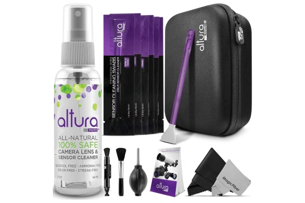
Altura Photo Professional Camera Cleaning Kit
- What We Like
- Comprehensive Kit
- All-Natural Cleaner
- Sensor-Specific Swabs
- Portability
- What We Don’t Like
- Swabs Size Limitation
- Limited Cleaning Fluid Size
- Risk of Improper Use
The Altura Photo Camera Sensor Cleaning Kit offers a comprehensive solution for maintaining camera lenses and sensors, particularly APS-C sensors. This kit includes a range of tools, such as 16mm dry sensor swabs, an all-natural 2oz lens cleaner, and various cleaning accessories like a lens cleaning pen, air blower, and microfiber cloths. Designed to remove invisible particles and smudges effectively, the cleaning fluid is safe for electronics and coated lenses, leaving no streaks or residue. With a convenient hard carrying case, this kit ensures portability and protection for photographers who need reliable cleaning tools on the go.